Mathematics
Mathematics
DURATION
20 days
DURATION
20 days
CLIENT
Mathematics
CLIENT
Mathematics
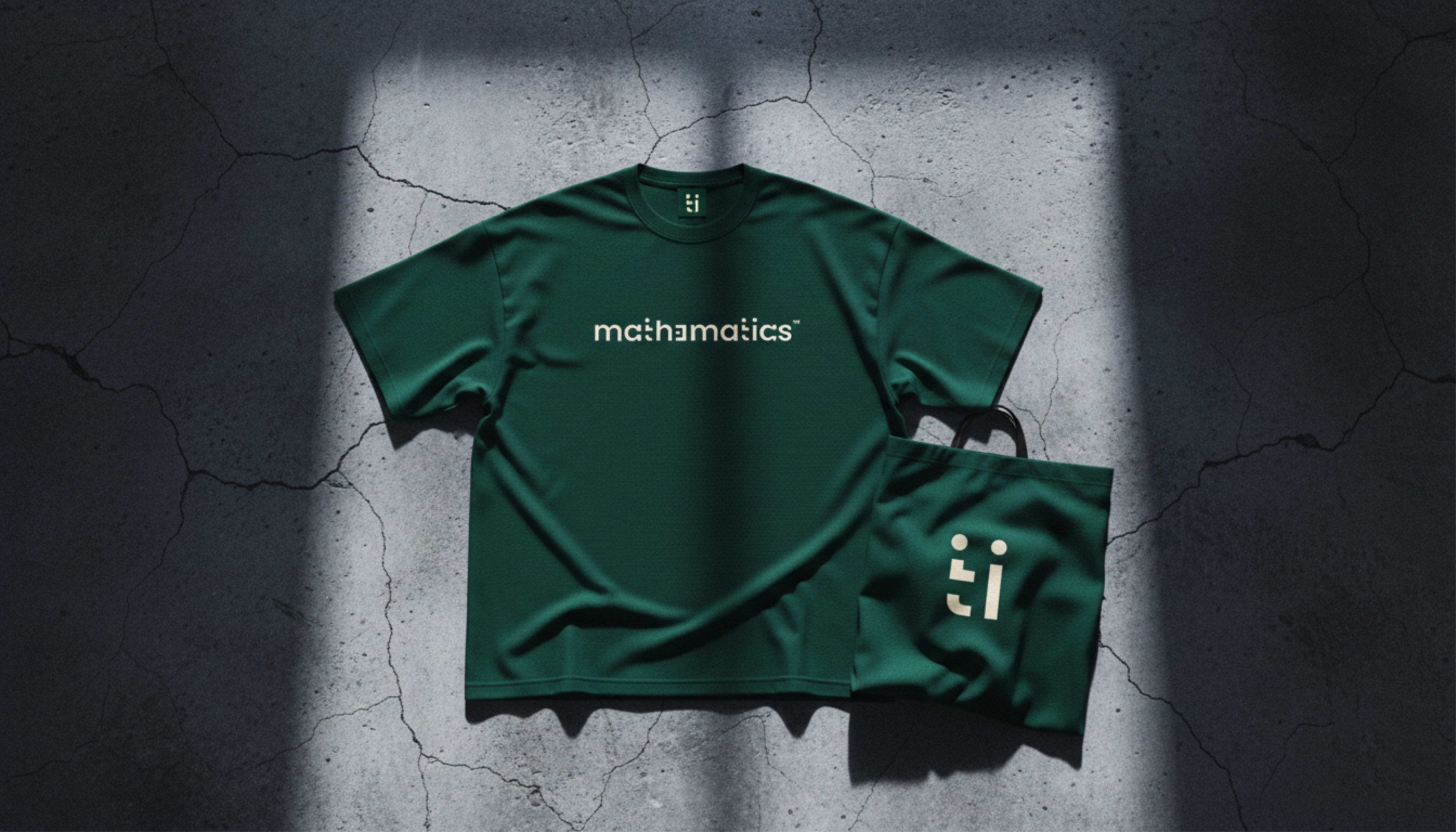
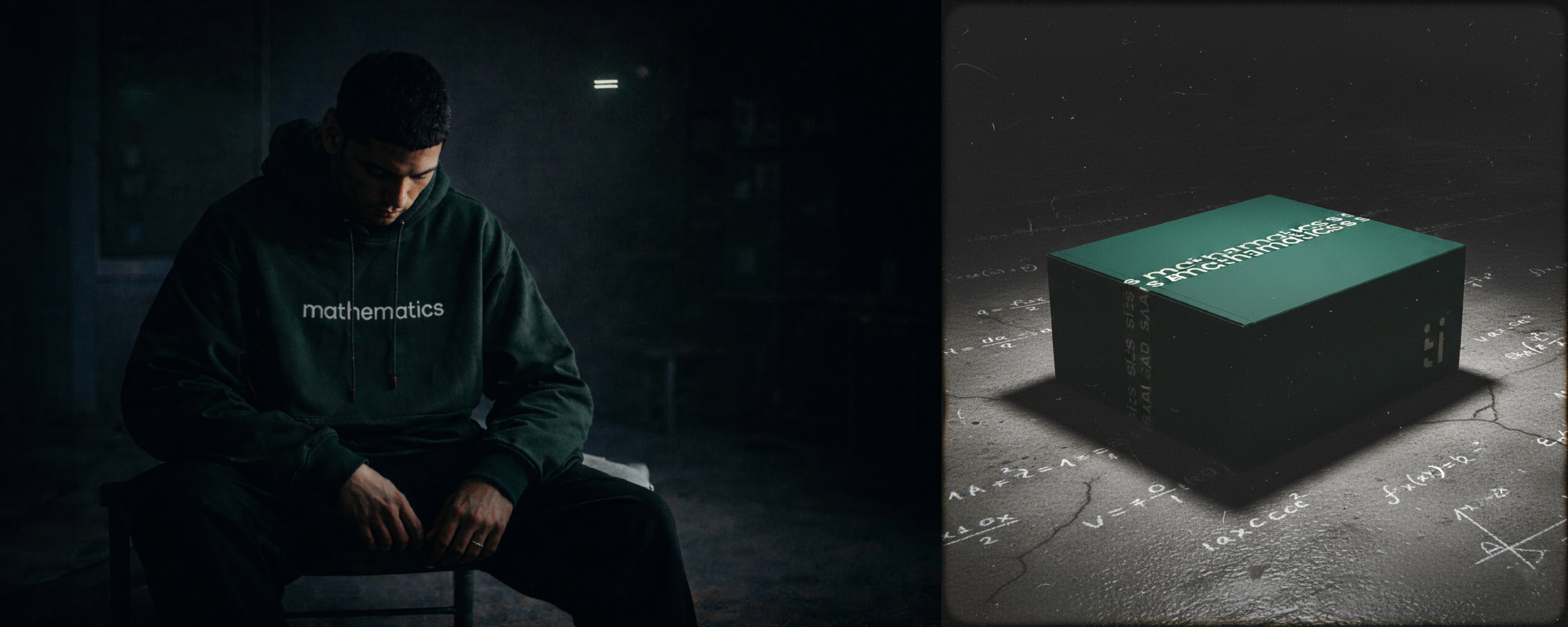
Logo Design
Logo Design
Brand Identity
Brand Identity
PROJECT OVERVIEW
PROJECT OVERVIEW
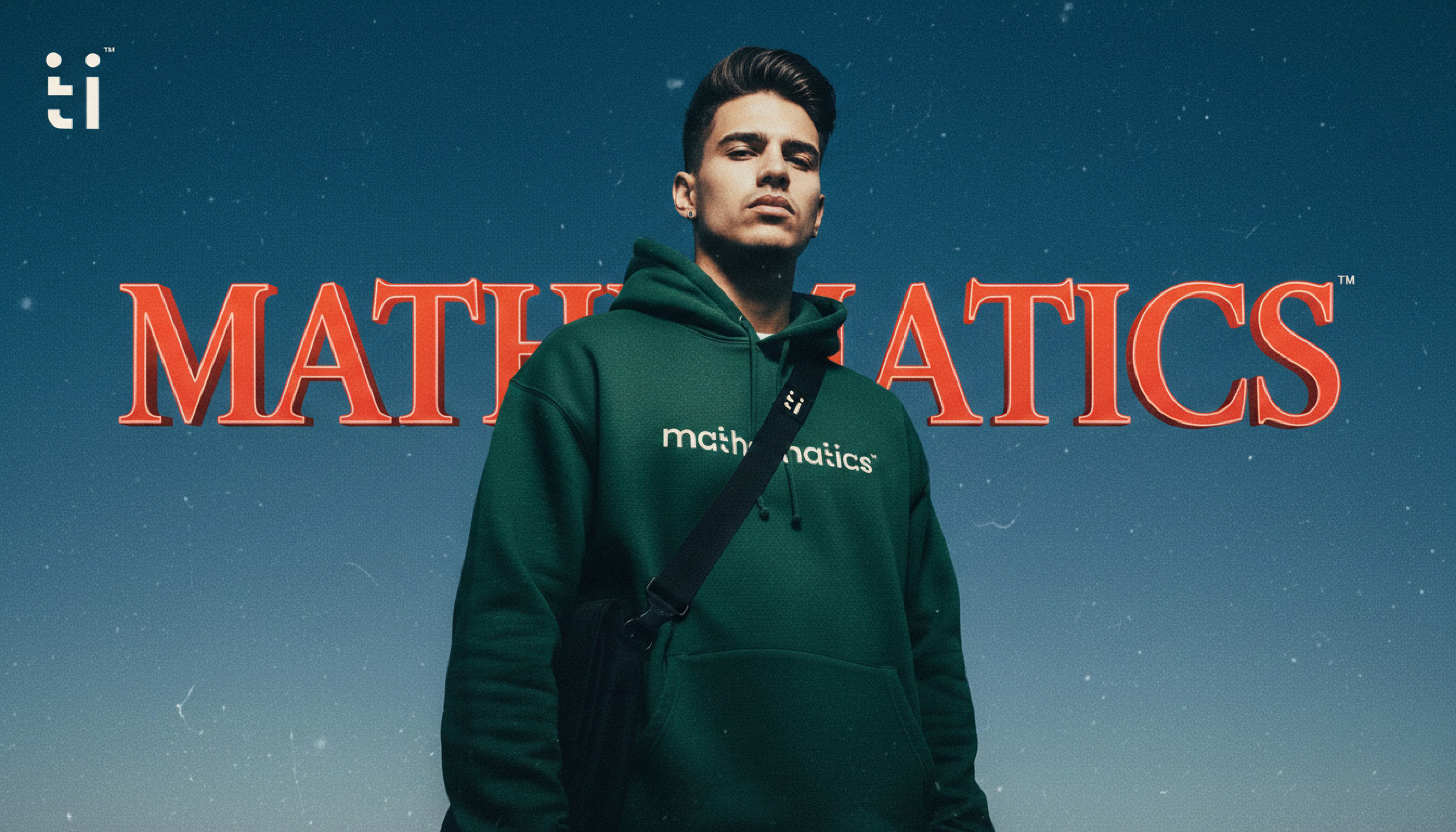
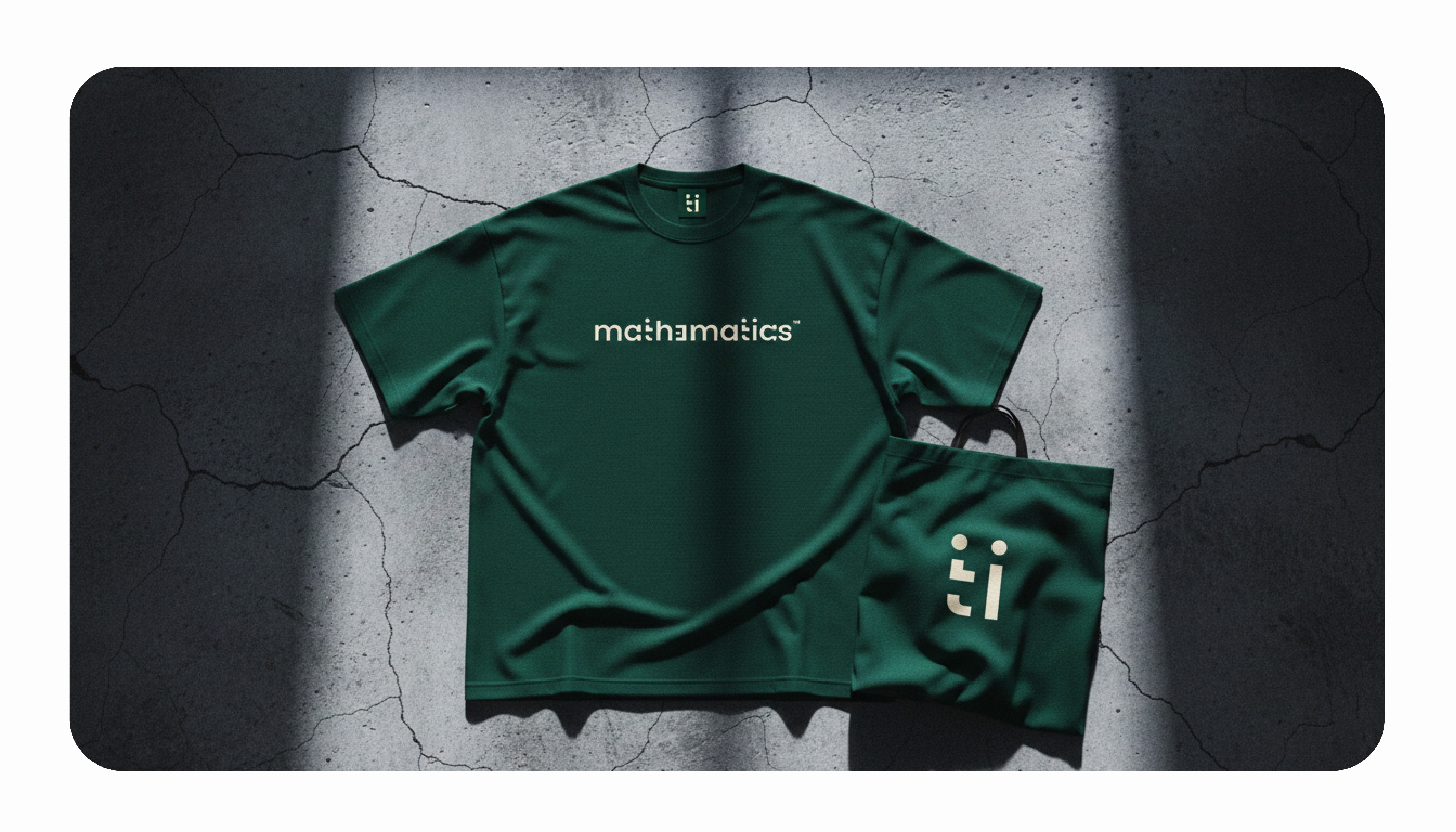
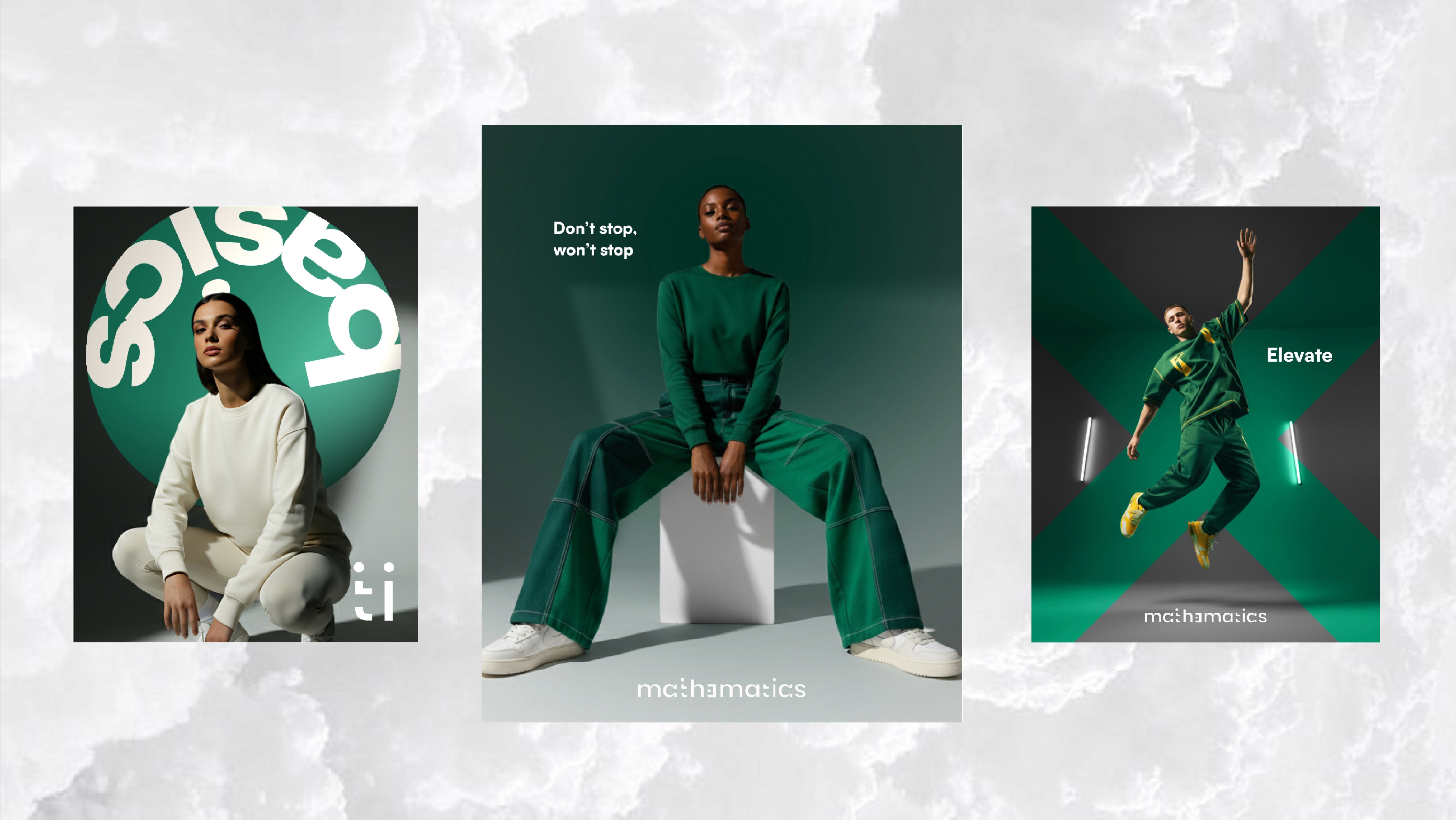
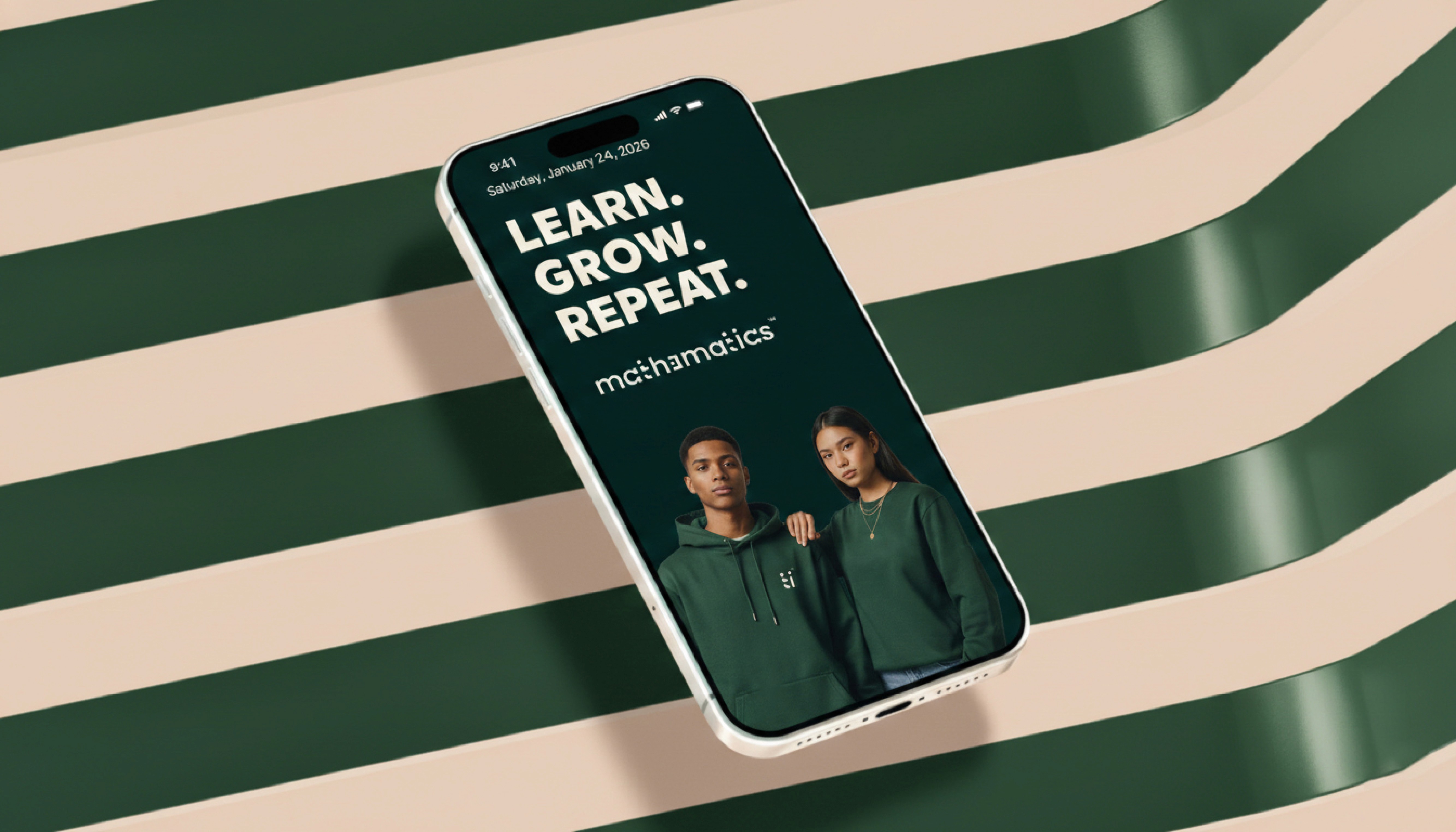
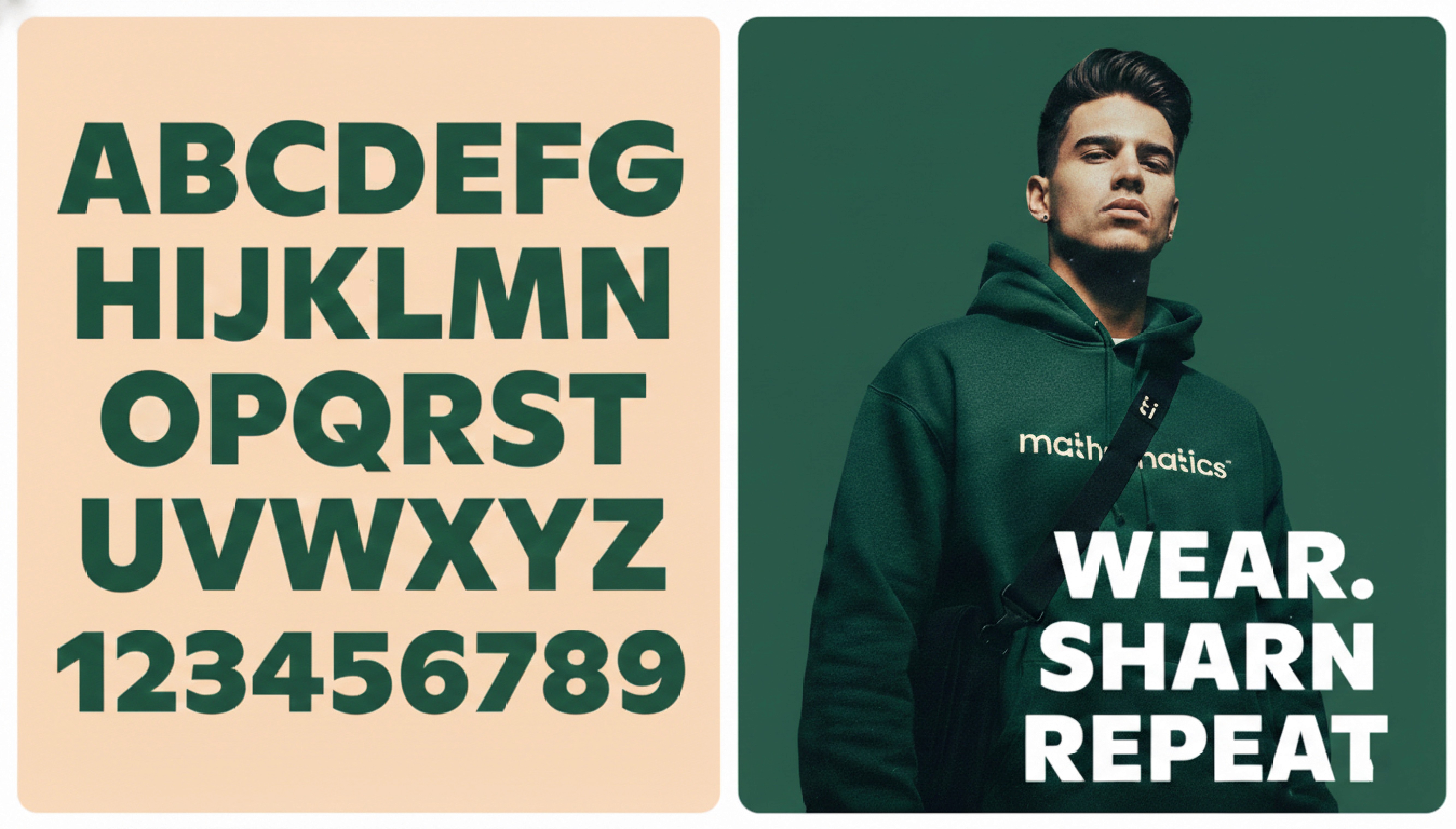
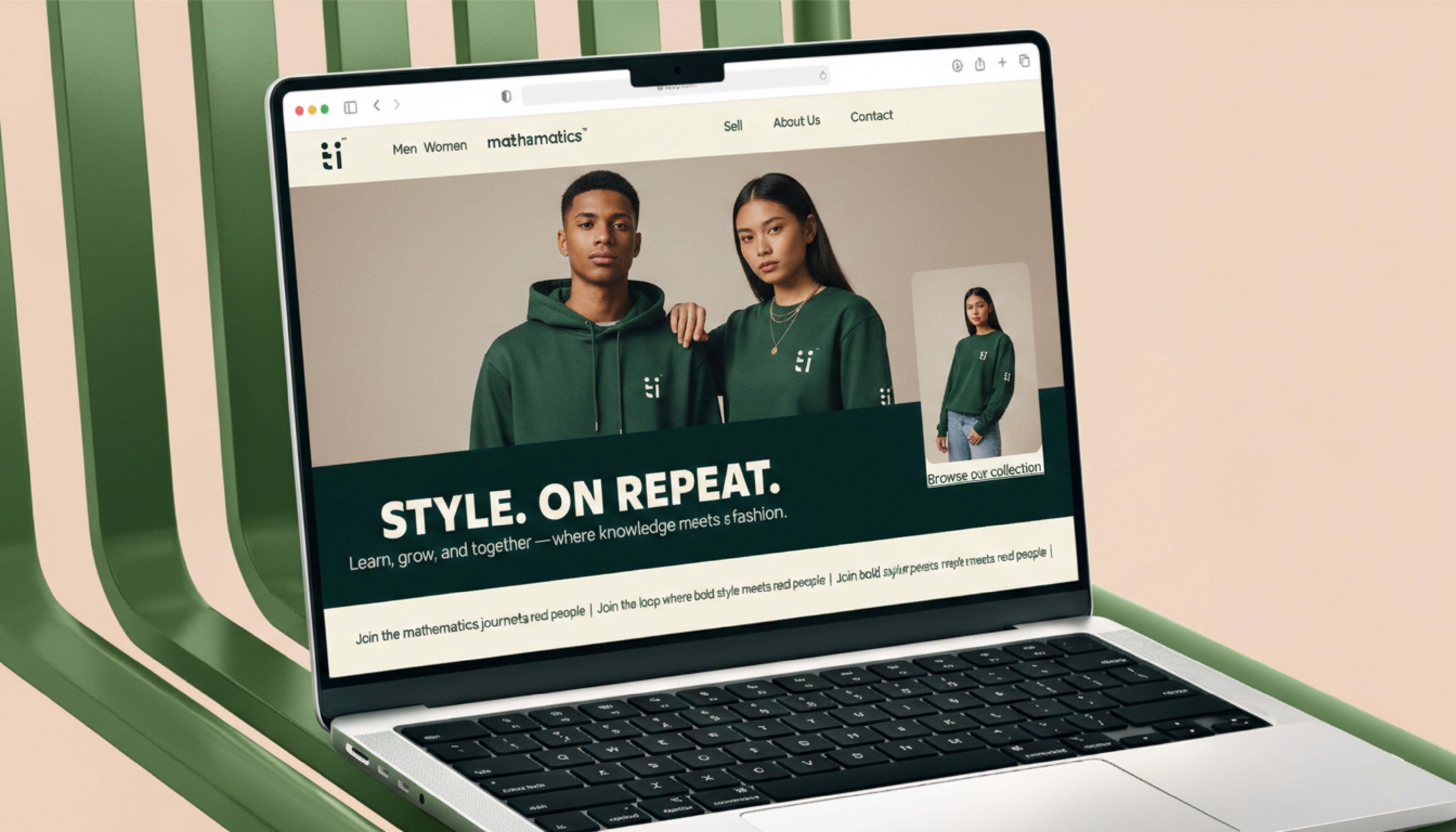
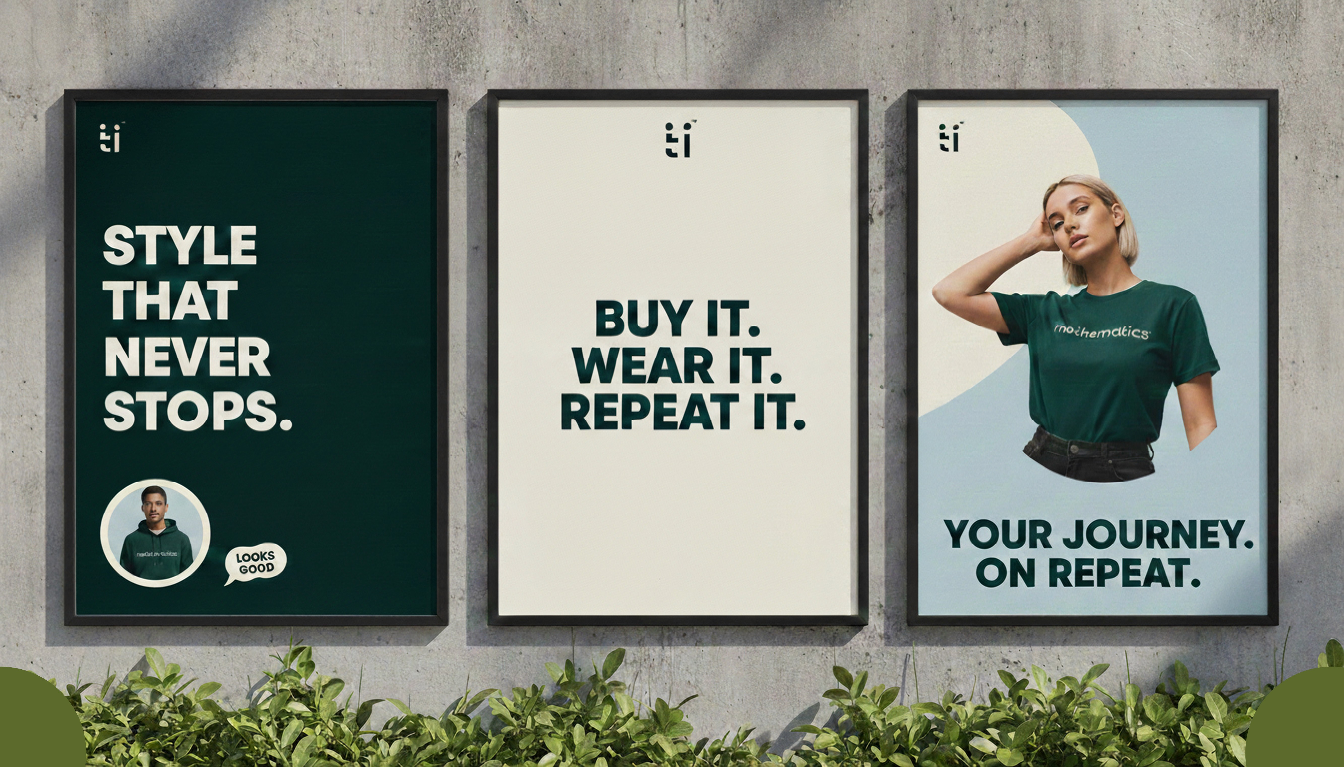
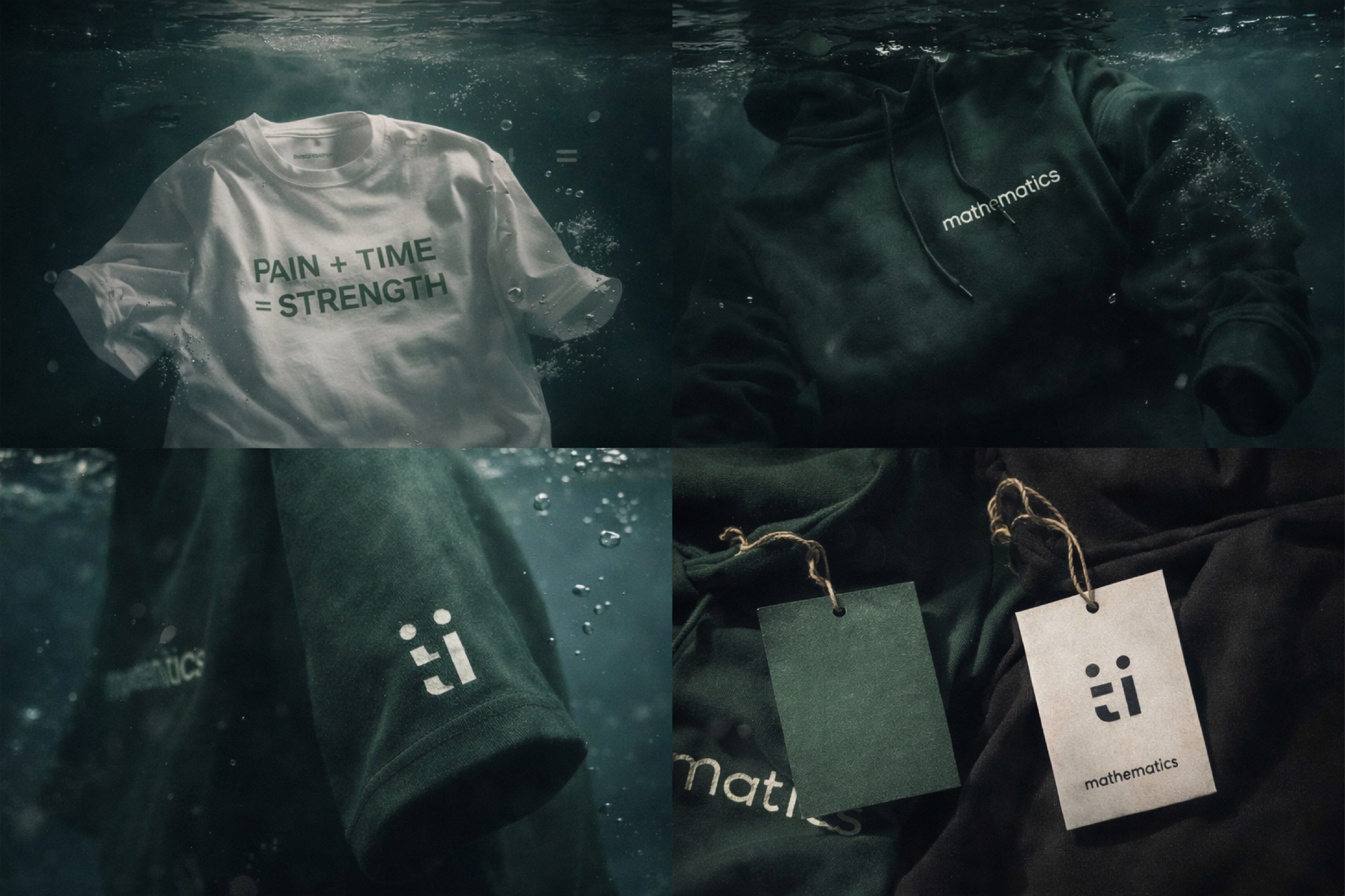
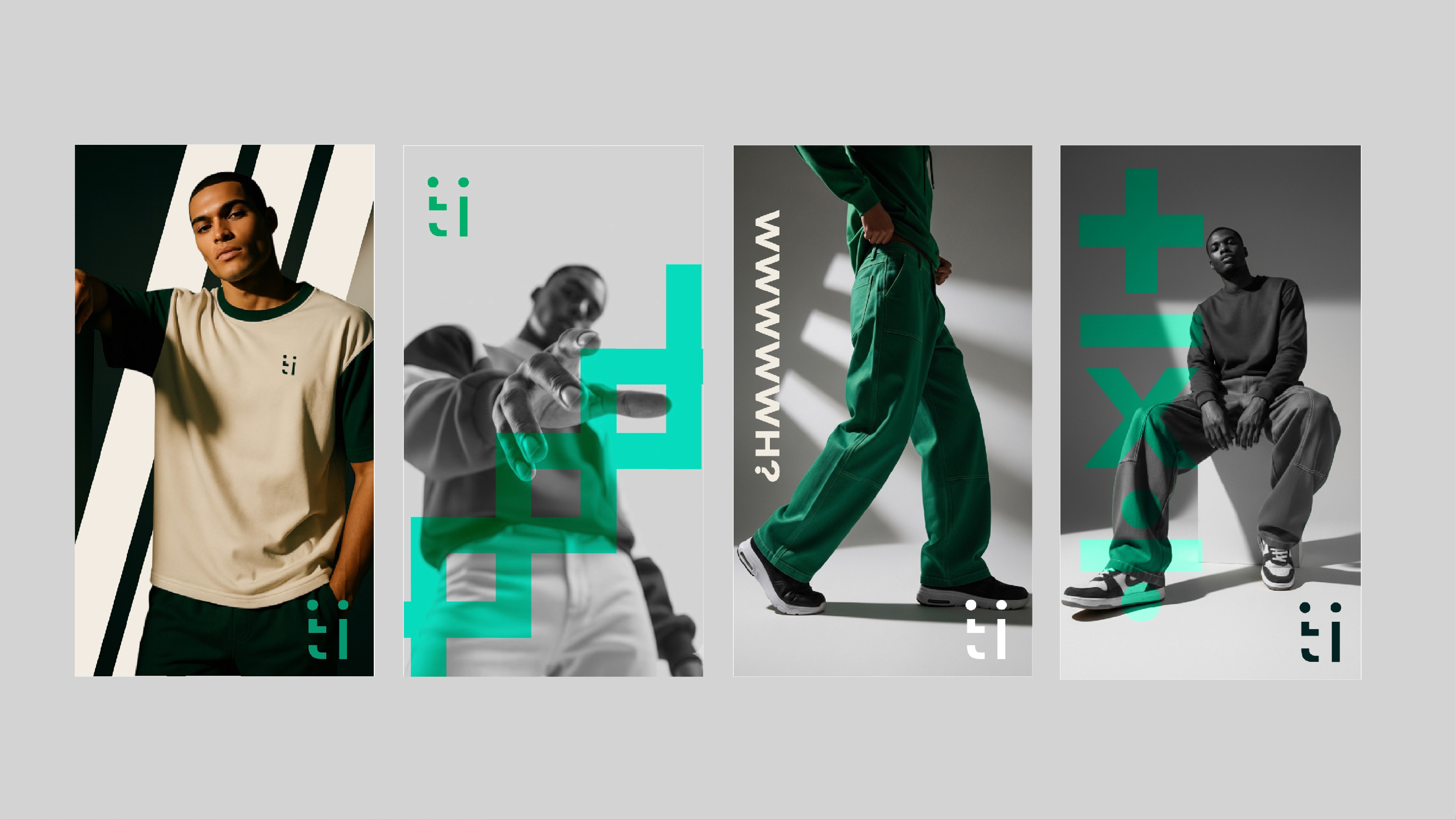
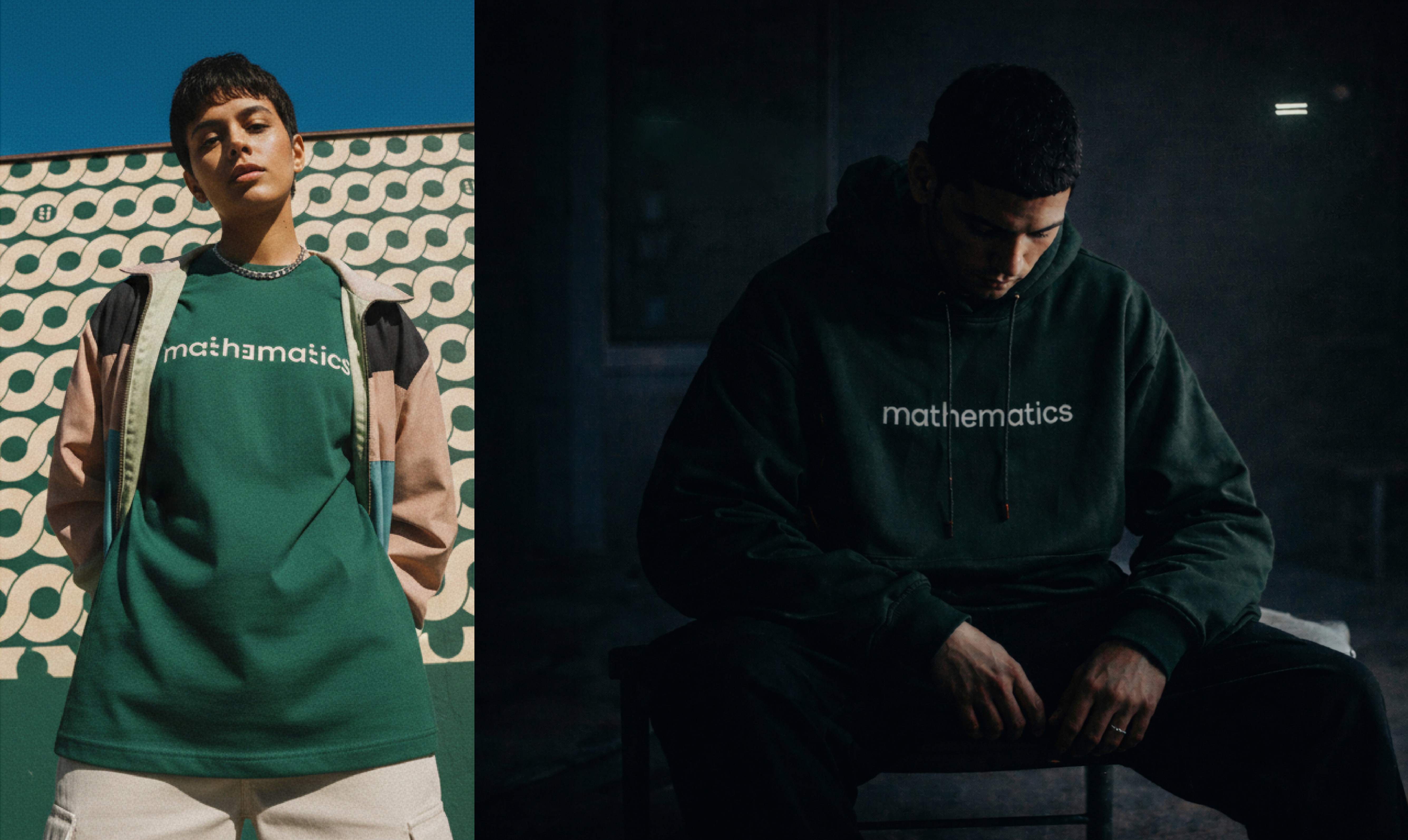
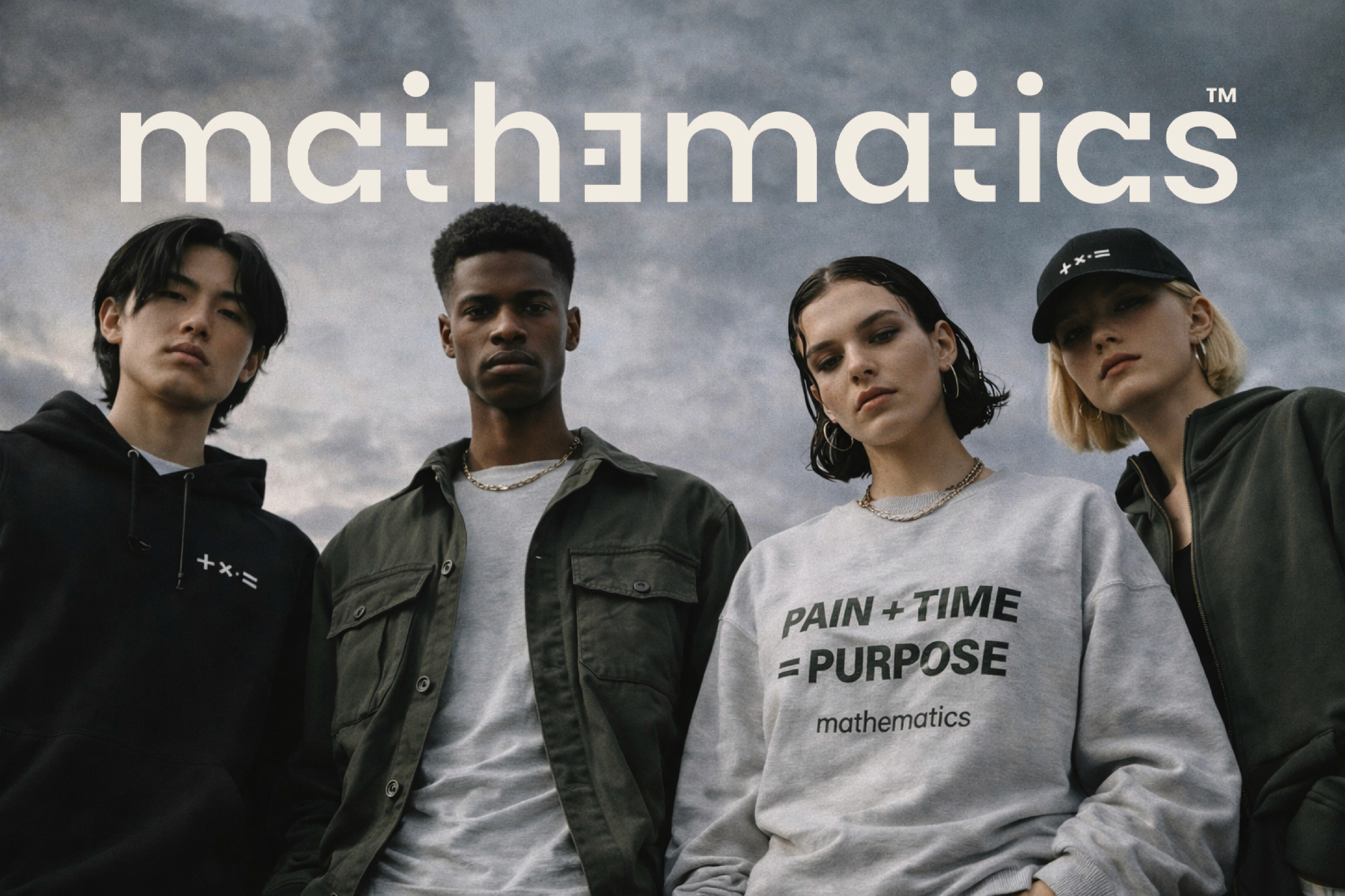
Mathematics is a mindset-driven streetwear brand built on the truth that life is an equation every choice, every struggle, every win adds up to who you become. It strips away hype and noise and replaces it with logic, discipline, and purpose, turning symbols like Σ, +, ×, ÷, and = into a language of growth and identity. The brand isn’t about fashion it’s about wearing your inner framework, your resilience, your process. It speaks to people who move with intention, who don’t run from pressure, who understand that success is calculated, not accidental. Mathematics is the uniform for individuals who solve themselves every day
Mathematics is a mindset-driven streetwear brand built on the truth that life is an equation every choice, every struggle, every win adds up to who you become. It strips away hype and noise and replaces it with logic, discipline, and purpose, turning symbols like Σ, +, ×, ÷, and = into a language of growth and identity. The brand isn’t about fashion it’s about wearing your inner framework, your resilience, your process. It speaks to people who move with intention, who don’t run from pressure, who understand that success is calculated, not accidental. Mathematics is the uniform for individuals who solve themselves every day
The Challenge
The Challenge
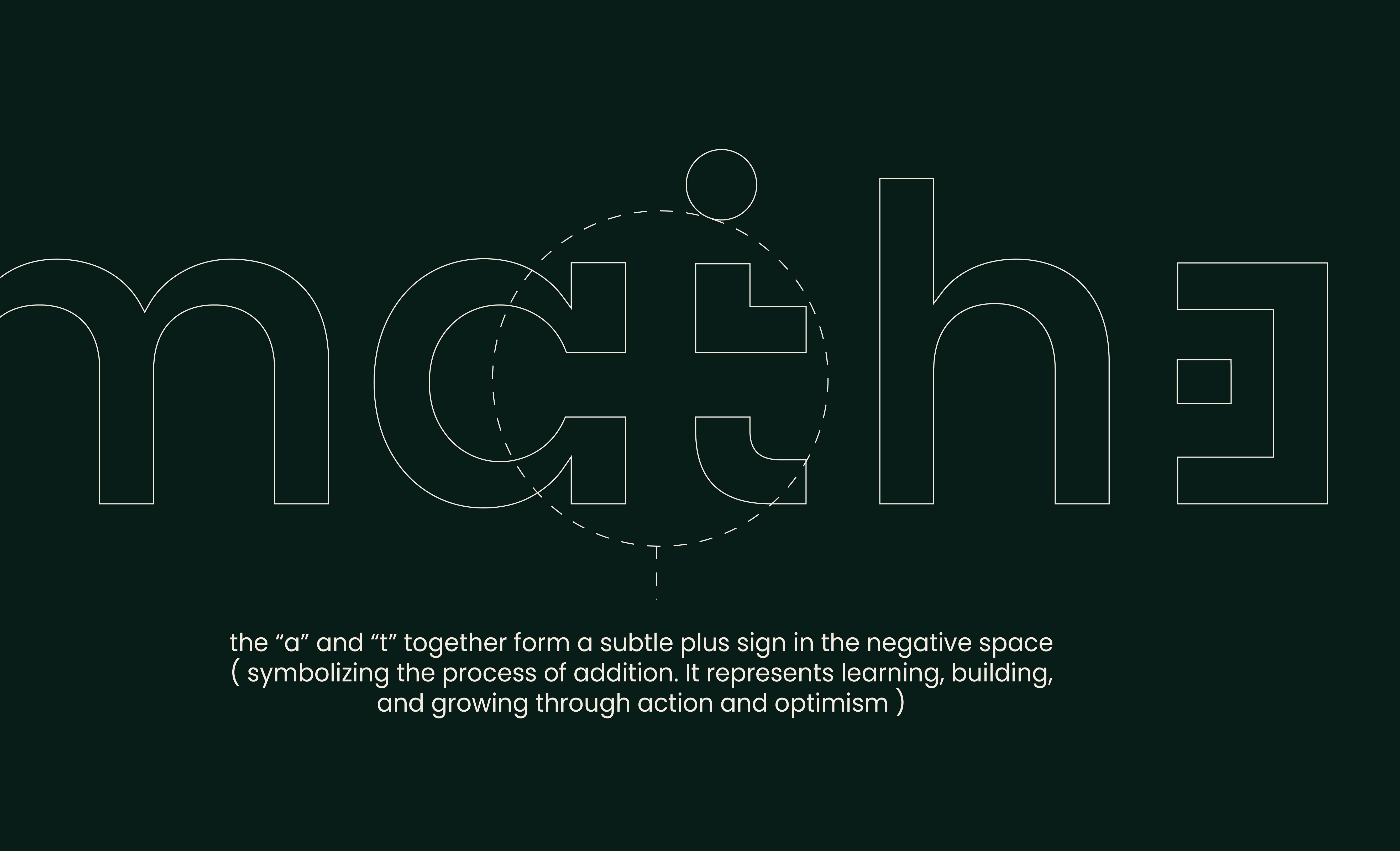
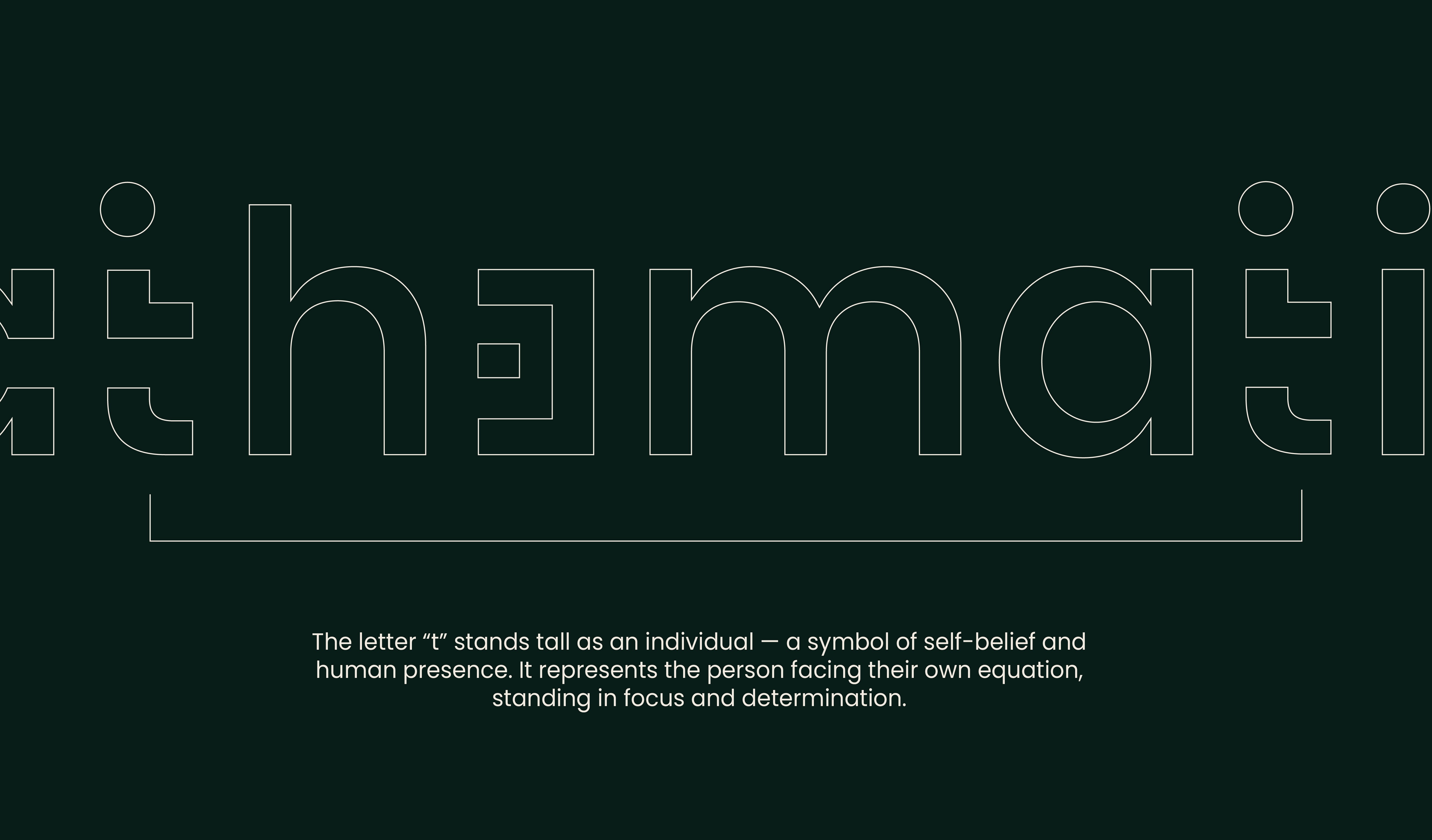
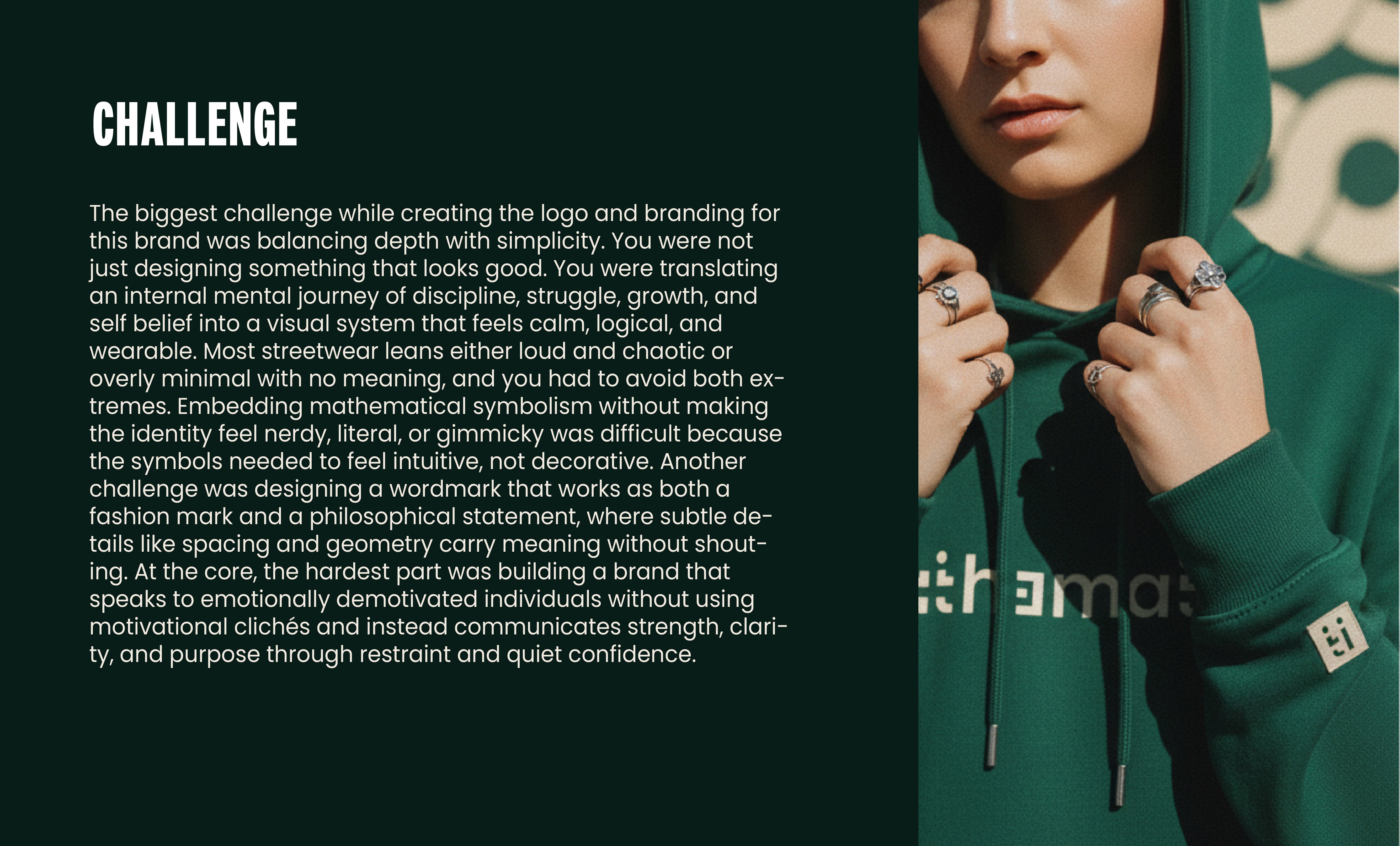
The biggest challenge while creating the logo and branding for this brand was balancing depth with simplicity. You were not just designing something that looks good. You were translating an internal mental journey of discipline, struggle, growth, and self belief into a visual system that feels calm, logical, and wearable. Most streetwear leans either loud and chaotic or overly minimal with no meaning, and you had to avoid both ex tremes. Embedding mathematical symbolism without making the identity feel nerdy, literal, or gimmicky was difficult because the symbols needed to feel intuitive, not decorative. Another challenge was designing a wordmark that works as both a fashion mark and a philosophical statement, where subtle de tails like spacing and geometry carry meaning without shout ing. At the core, the hardest part was building a brand that speaks to emotionally demotivated individuals without using motivational clichés and instead communicates strength, clari ty, and purpose through restraint and quiet confidence
The biggest challenge while creating the logo and branding for this brand was balancing depth with simplicity. You were not just designing something that looks good. You were translating an internal mental journey of discipline, struggle, growth, and self belief into a visual system that feels calm, logical, and wearable. Most streetwear leans either loud and chaotic or overly minimal with no meaning, and you had to avoid both ex tremes. Embedding mathematical symbolism without making the identity feel nerdy, literal, or gimmicky was difficult because the symbols needed to feel intuitive, not decorative. Another challenge was designing a wordmark that works as both a fashion mark and a philosophical statement, where subtle de tails like spacing and geometry carry meaning without shout ing. At the core, the hardest part was building a brand that speaks to emotionally demotivated individuals without using motivational clichés and instead communicates strength, clari ty, and purpose through restraint and quiet confidence
WHAT WE DID
WHAT WE DID
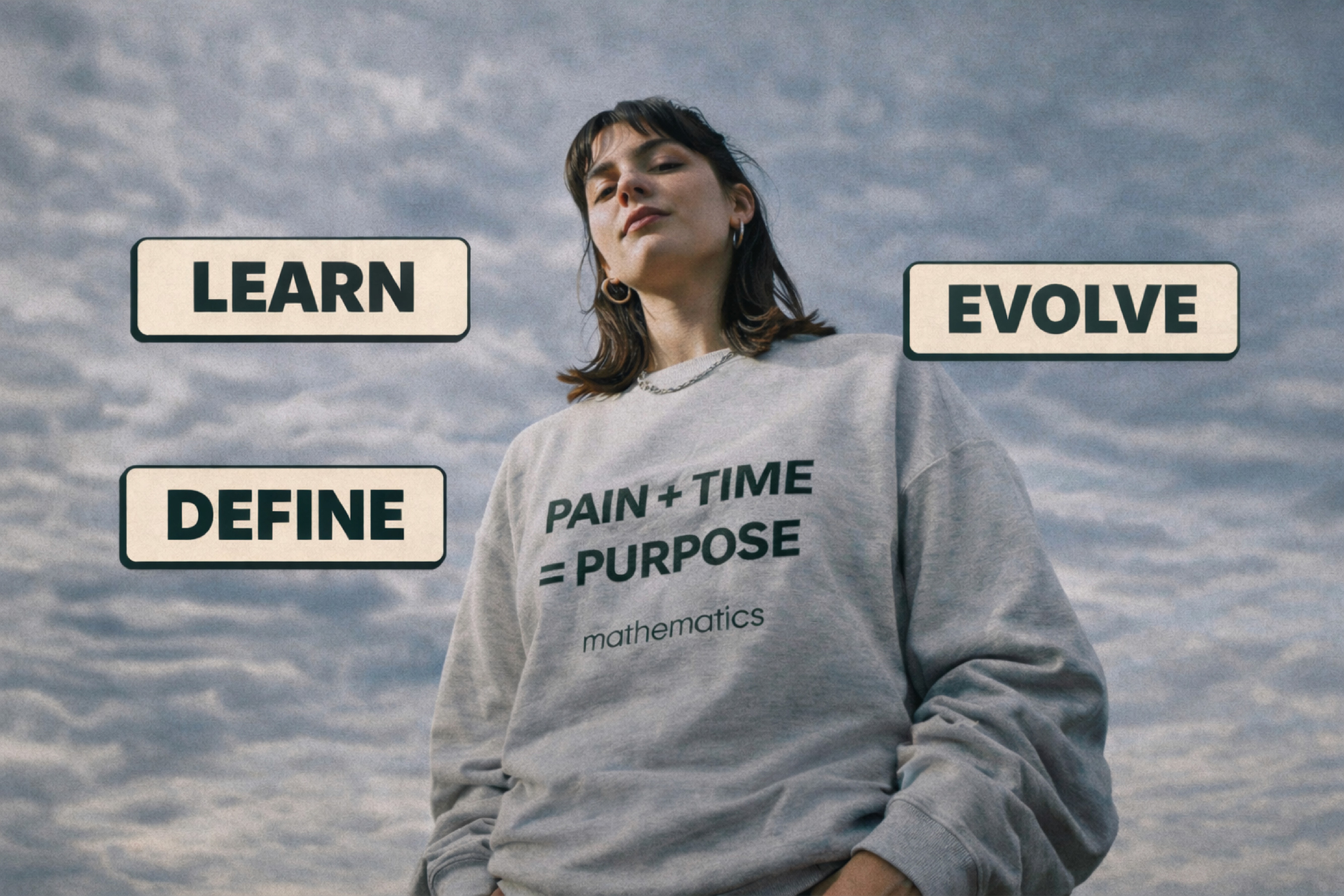
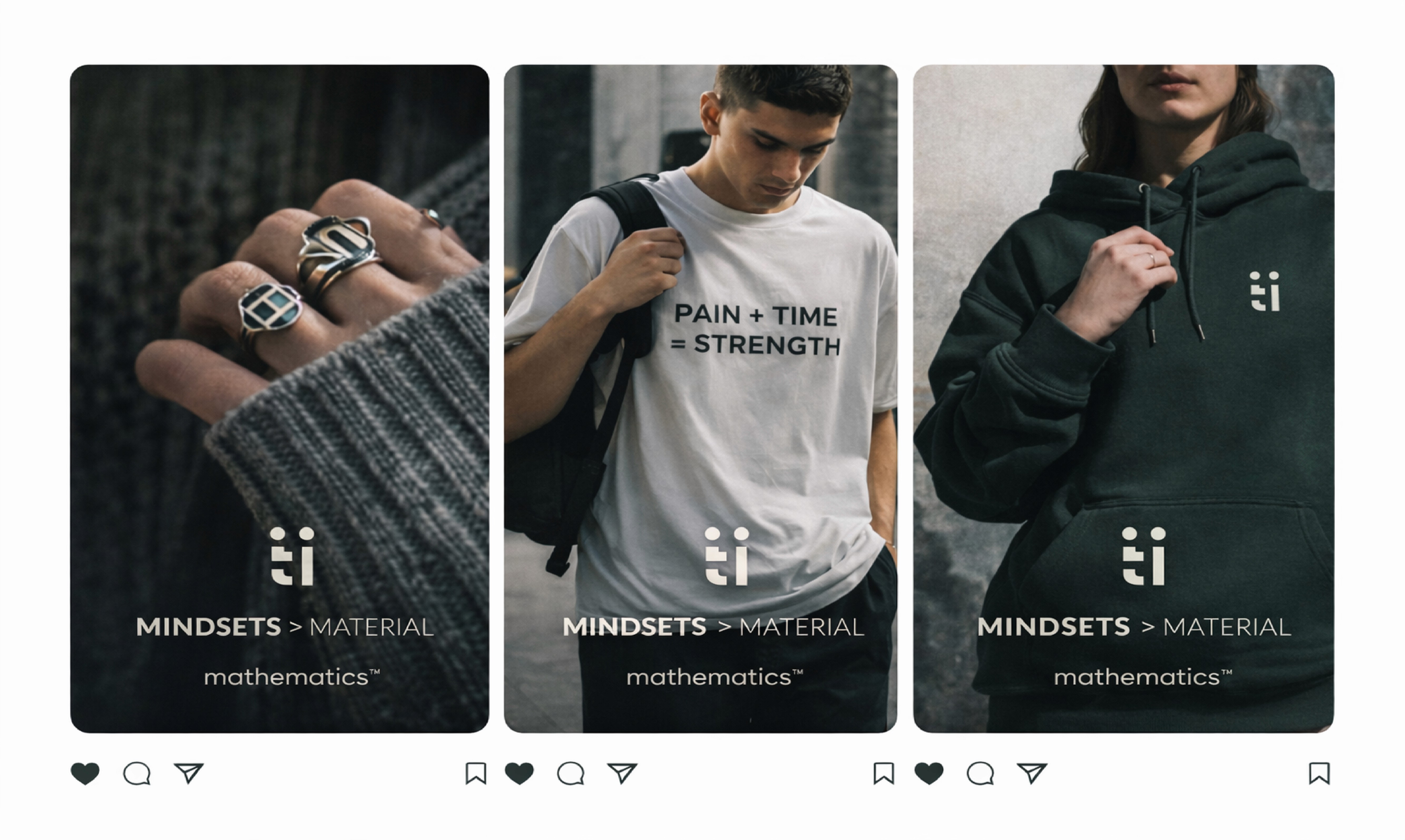
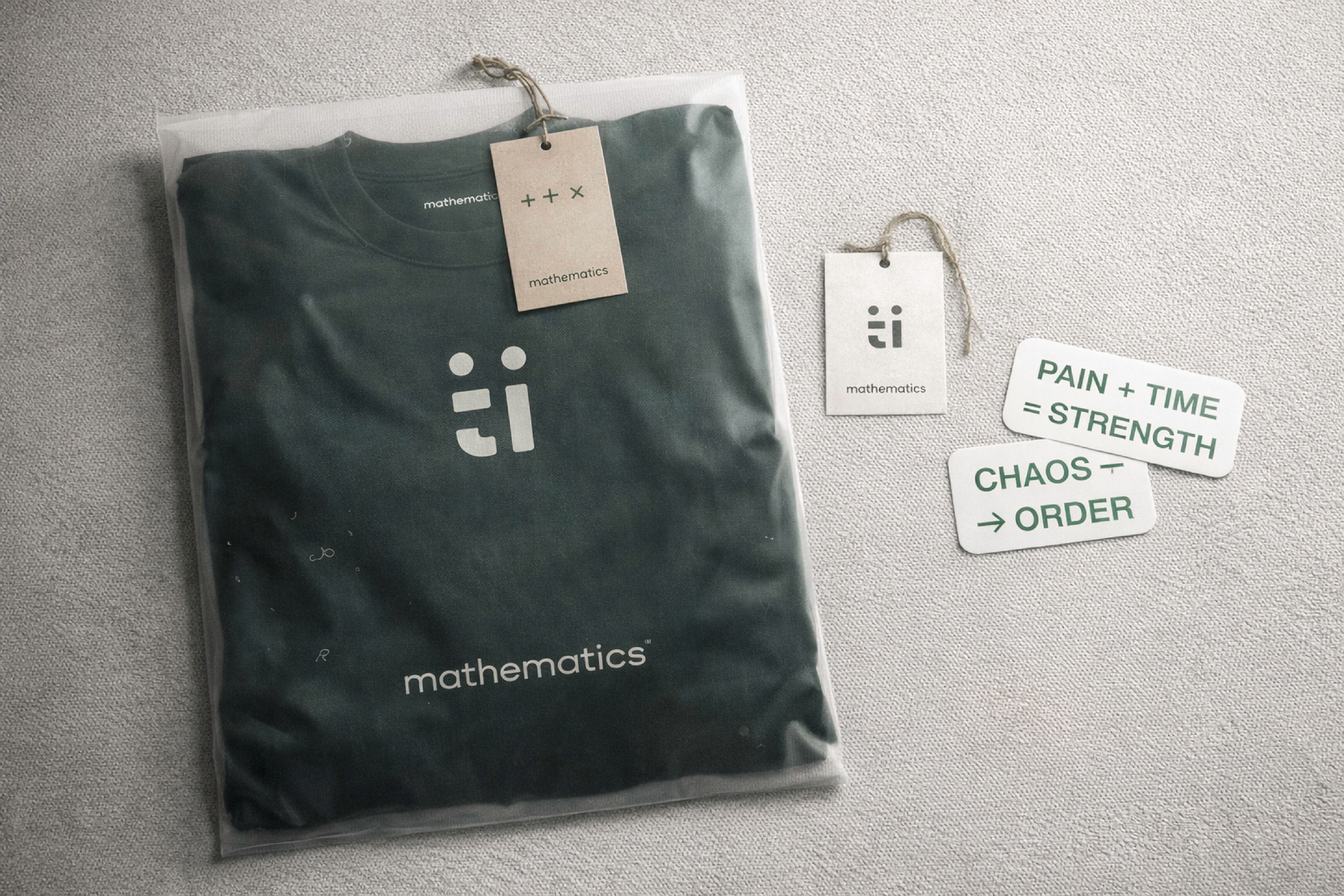
We help them by creating a brand identity which will serve for the individuals who are demotivated in their life as the main motive of the brand is to target those individuals only and we tried to replicate every phase of through mathematical symbols like sigma for representing all the factors that happened with the individual, multiplication for collaboration, division for departure, minus for negativity etc
We help them by creating a brand identity which will serve for the individuals who are demotivated in their life as the main motive of the brand is to target those individuals only and we tried to replicate every phase of through mathematical symbols like sigma for representing all the factors that happened with the individual, multiplication for collaboration, division for departure, minus for negativity etc

